Web Design and Development
Website Design Services
Design and build professional websites for Pakistani businesses with clear positioning, fast mobile UX, and lead-focused conversion paths.
Explore the detailDesign system implementation that installs a single source of truth for your website, covering design tokens, a reusable component library, and CMS-wired patterns every future page is built from.
Web Design and Development
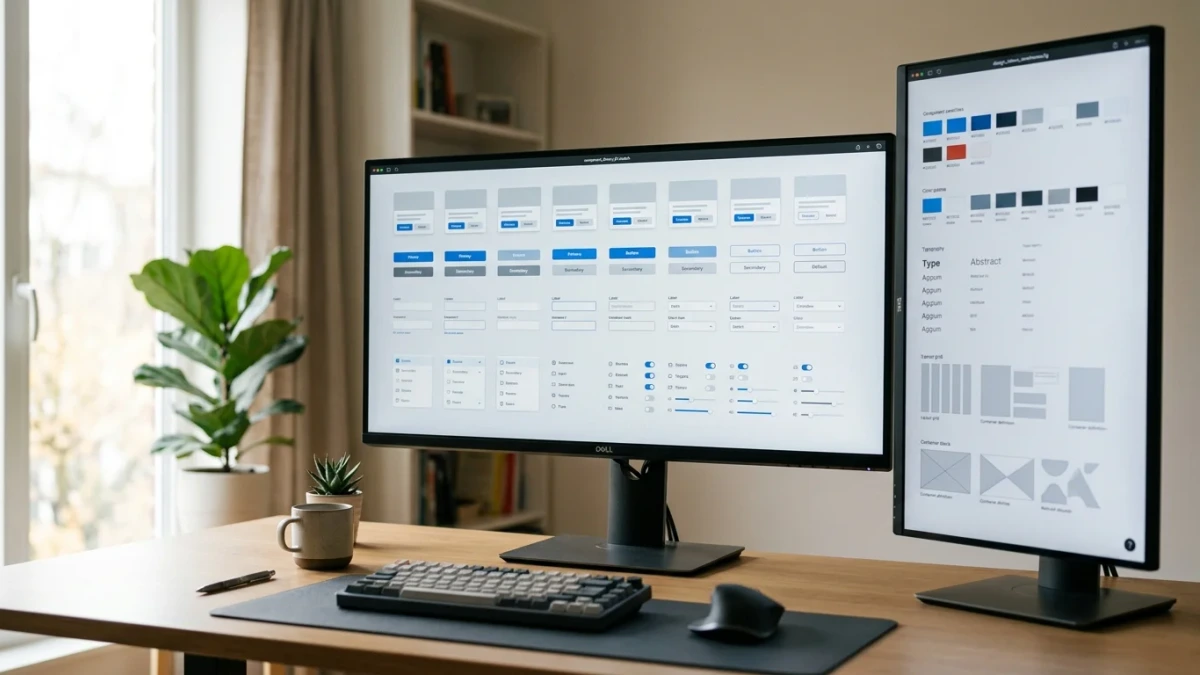
Design system implementation that installs a single source of truth for your website, covering design tokens, a reusable component library, and CMS-wired patterns every future page is built from.
Review real user journeys, mobile behaviour, content access and integration outcomes against the agreed acceptance criteria.
A closer look
The approach, practical steps and decisions behind the plan.
Most Pakistani websites do not have a design problem. They have a consistency problem. The homepage was built by one freelancer, the product pages by an agency two years ago, the campaign landing pages by whoever was free that week, and last month’s pages by an AI tool. Each made reasonable local decisions, and together they make the brand look like five different companies.
WeProms Digital implements design systems for websites in exactly this situation. We codify your brand into design tokens, build a documented component library inside your actual stack, and wire it into your CMS so every future page, whether it comes from your team, a freelancer, or an AI assistant, ships from the same approved parts. The site stops being a pile of one-off pages and becomes an asset that gets cheaper to extend every month.
Interface drift is not carelessness. It is what happens when no shared source of truth exists. A developer needs a button style and copies the nearest one. A page builder adds a heading at whatever size looks right that day. A campaign landing page ships with new spacing because the old template felt cramped on mobile. Every decision is small. After a year you have four button styles, six greys, and a checkout that looks unrelated to the product pages feeding it.
The cost shows up in three places. First, trust. When Pakistani shoppers on mobile cannot tell whether the checkout page belongs to the same store as the product page, they abandon at exactly that moment of doubt, and a cash-on-delivery market feels that doubt more than most. Second, speed. Every page gets built from scratch because nothing is reusable, so campaign pages take days instead of hours and marketing waits on development. Third, maintainability. A brand refresh or a price-display change means hunting through every template, and the one that gets missed stays wrong for months.
The newest pressure is volume. Page builders and AI tools now generate layouts faster than any team can review them. Without a system that constrains what generated pages are allowed to look like, drift stops accumulating slowly and starts accelerating.
A design system as we implement it has three working layers.
The first is the token layer. Every recurring visual decision, from brand colors and the grey scale to heading sizes, line heights, spacing steps, corner radii, and breakpoints, is defined once as a named token. Tokens are organized in tiers, from raw values up to semantic ones like surface, text, and action, so a rebrand or a seasonal theme changes the mapping in one place rather than in every stylesheet. From that single source we generate the outputs your stack consumes, starting with CSS custom properties and extending to the formats WordPress and Shopify themes read natively.
The second is the component library. Buttons, forms, cards, navigation, product tiles, pricing tables, FAQ accordions, and testimonial blocks are the patterns your pages are actually made of. Each gets built once, with every variant, state, and responsive behavior documented. On WordPress these become block patterns that render identically in the editor and on the front end. On Shopify they become Liquid sections with controlled settings a merchant cannot break. On custom stacks they are React or Astro components built on headless primitives, so keyboard, focus, and screen-reader behavior survive the styling.
The third is governance. These are the written rules that keep the system alive after handover, covering token naming, when a new variant is justified, and how a page that genuinely needs something new gets it added to the library instead of hacked around it.
We build inside the stacks Pakistani businesses actually run. WordPress and WooCommerce remain the default for SMEs, so block patterns, editor parity, and token mapping through theme.json get particular attention. Shopify stores get component libraries that respect how merchandising teams actually edit sections. Astro and custom builds get a token pipeline that feeds Tailwind’s theme layer directly, the same modern setup we run on our own site.
Local browsing conditions shape the components themselves. Most of your visitors are on mid-range Android phones over inconsistent connections, so every pattern is designed for small screens first, built to render without layout shift, and kept light enough to load on modest bandwidth. Checkout and cash-on-delivery confirmation flows get the strictest consistency treatment, because that is where visual doubt converts most directly into abandoned orders. And for brands serving bilingual audiences, the type scale is built to hold both English and Urdu text without breaking layouts, including right-to-left layouts where your audience needs them.
AI page generation has made design systems more valuable, not less. When a tool assembles a landing page in minutes, the question is no longer whether the page can be produced quickly. It is whether the output respects your brand, your accessibility baseline, and your checkout conventions. The direction the industry has settled on is the one we build towards, which is that generated pages should assemble from governed, pre-approved components rather than invent their own markup. A well-built design system is the constraint that makes fast generation safe. Your team reviews whether the right patterns were used, not whether every button on every generated page happens to match.
This is also why we implement in your real stack rather than delivering a standalone style guide. A library that lives only in a design tool constrains nothing. The version that protects your brand is the one your CMS, your page builders, and your AI tools actually pull from.
Most design systems fail quietly, months after launch, when the first deadline pressure pushes a team to bypass the library and hardcode a one-off page. We design against that failure mode deliberately. Components are documented in plain language with examples your marketers can understand, not just your developers. The governance rules define the escape hatch, which is how to ship something the library does not cover yet without permanently forking it. And we apply restraint in the other direction too. We tokenize the decisions that genuinely recur and leave local layout choices free, because an over-abstracted system gets ignored as completely as no system at all.
After handover you can run the system with your own team, or keep us on a governance retainer that adds components as your catalogue and campaigns grow, audits new page types for drift, and keeps the documentation current.
Ecommerce brands and multi-service businesses in Pakistan whose site has grown past the point where every page can be handmade. Shopify and WooCommerce stores with large catalogues, service businesses accumulating landing pages, and any team that has watched three developers ship three different versions of the same form. It is also the right investment before a rebrand or a site migration, when consolidating onto a system stops the new site from drifting back into the same problem within a year.
Related services
Web Design and Development
Design and build professional websites for Pakistani businesses with clear positioning, fast mobile UX, and lead-focused conversion paths.
Explore the detailWeb Design and Development
Develop and optimize WordPress websites for speed, SEO, and conversion.
Explore the detailWeb Design and Development
Design websites around conversion goals, trust signals, and clear user journeys.
Explore the detailA few of the brands we’ve worked with.








See where the work happens and get to know WeProms before your first conversation. Our team is based in Lahore, working with business owners abroad and at home.
Get to know WeProms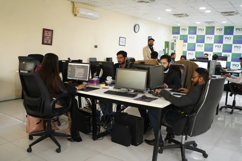 Watch our introduction
 Published client experiences
Hear what working with WeProms was like, directly from our clients.
 Watch their story
 Singapore · Events
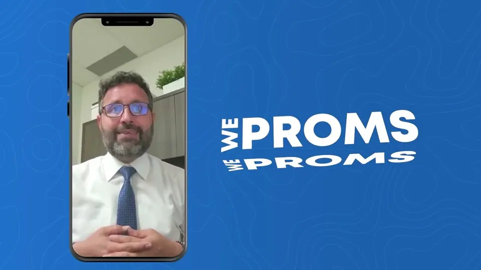 Watch their story
 Client feedback
 Watch their story
 New York · Wellness
Inside WeProms
Lahore, Pakistan
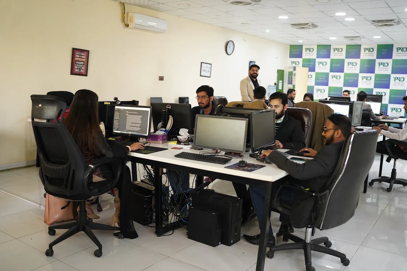
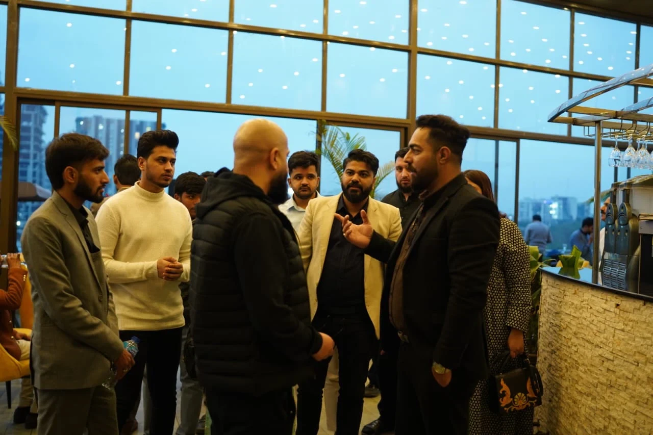
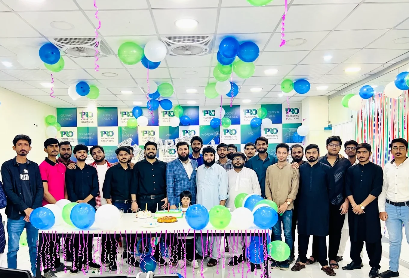
154, C1, Nespak Housing Scheme, Lahore 54770, Pakistan.
Working with a remote marketing team
You know your customers and market. Our strategists, creatives and technical specialists in Lahore help put the plan into practice. Agree the contact person, meeting times and approvals before we start.
Agree deliverables and the agency fee. Discuss ad spend and third-party tools separately.
Keep visibility and ownership. Agree access, asset licences and handover as part of the scope.
Agree a review schedule around your time zone. See what was delivered, what the numbers mean and what comes next.
Explore our Pakistan pricing guides for planning ranges and what shapes the cost. Your market, deliverables and existing setup determine the final quote; advertising spend and third-party costs are separate.
Discuss a quote for your market ↗Before the next step
A useful starting brief includes: website and hosting context; content, products and brand assets; required integrations and approvals. We can agree appropriate access after the first conversation.
Review real user journeys, mobile behaviour, content access and integration outcomes against the agreed acceptance criteria.
We can discuss a one-off implementation, an ongoing scope or an initial build followed by support. The proposal states what is included, dependencies and the review points.
Agency work, media spend and third-party costs are identified separately. Your market, existing setup and delivery requirements determine the final scope and quote.
Share your website, target country and the next thing you want to improve. We’ll help you find a useful place to start.