Case Studies

Progressive Form Redesign for a Peshawar University Admissions Funnel

Admission form completion lifted 44% (27% to 39%) in 90 days, with mobile completion up 55% and paid cost per completed application down 28%.

Progressive Form Redesign for a Peshawar University Admissions Funnel campaign results dashboard
Case study Education
Result snapshot +44% relative lift

Answer-ready summary

What happened in this case study?

Admission form completion lifted 44% (27% to 39%) in 90 days, with mobile completion up 55% and paid cost per completed application down 28%.

A chartered private university in Peshawar was losing nearly three of every four applicants inside its own admission form. The form asked for 31 fields on a single desktop-first page, demanded document uploads before an applicant could proceed, and threw submit-time error walls on a channel where 68% of traffic is mobile. The engagement diagnosed the funnel field by field and rebuilt it as a progressive flow.

The rollout used 4 implementation phases: technical cleanup, architecture, content, and authority building.

At a glance

Case summary

Industry
Education (higher education admissions)
Market
Pakistan (Peshawar)
Duration
90 days
Client type
Education
Services used
Form optimization and lead capture UX, Conversion rate optimization, Analytics and event tracking
Starting problem
A 31-field single-page admission form was losing 73% of starters, with the steepest drop-offs at document upload and the error-prone final submit.
Work completed
Instrumented every field, rebuilt the form as a four-step progressive flow with conditional logic and post-submit document verification, and tested variants before a full rollout.
Evidence type
illustrative_composite

Results and proof

Measured impact at 90 days

The top-line numbers are separated from the narrative so buyers, search engines, and answer engines can understand the outcome before reading the full execution notes.

+44% relative lift

Form completion rate

27% → 39% (+44% relative lift)

+55%

Mobile completion rate

20% → 31% (+55%)

+46%

Completed applications in peak month

1,090 → 1,600 (+46%)

PKR 4,100 → PKR 2,950

Paid cost per completed application

PKR 4,100 → PKR 2,950 (−28%)

Measured metrics

Before and after

39% (+44%) Form completion rate
31% (+55%) Mobile completion rate
PKR 2,950 (−28%) Paid cost per completed application
6% of starters Document-stage abandonment

Challenge context

Challenge context

A chartered private university in Peshawar was losing nearly three of every four applicants inside its own admission form. The form asked for 31 fields on a single desktop-first page, demanded document uploads before an applicant could proceed, and threw submit-time error walls on a channel where 68% of traffic is mobile. The engagement diagnosed the funnel field by field and rebuilt it as a progressive flow.

Form completion stuck at 27% overall and 20% on mobile

31 fields on one page with document upload as a blocking step

68% of form traffic on mobile against a desktop-first layout

Around 4,050 form starts per peak intake month producing about 1,090 completions

Form-status and resubmission calls made up 38% of peak-season call volume

No field analytics, no error tracking, no save-and-resume

Execution roadmap

Implementation phases

The page now presents the process as a scannable roadmap before the long-form breakdown, improving buyer comprehension and passage-level retrieval.

01

Phase 1

Funnel diagnostics and field analytics (Weeks 1–2)

02

Phase 2

Progressive redesign and rebuild (Weeks 3–6)

03

Phase 3

Test, iterate, and harden (Weeks 5–8)

04

Phase 4

Roll out, hand off, and measure (Weeks 8–12)

The Client

The client is a chartered private university in Peshawar with around 6,400 enrolled students across four faculties — computing, business, engineering technology, and law — offering 34 undergraduate and postgraduate programs. Admissions run on two intakes, with the fall cycle carrying roughly 70% of annual volume. Marketing for admissions is a seasonal sprint: a two-person admissions office, an outsourced paid agency spending about PKR 1.8M across the peak months, open-house events at local colleges, and a website whose admission form had been patched, never redesigned, since it was built.

By any external measure the university was healthy — applications grew most years, and the brand carried weight in Khyber Pakhtunkhwa. Peak-season traffic arrived from a familiar mix for Pakistani admissions: paid search and Meta campaigns run by the agency, open-house QR codes scanned at partner colleges, WhatsApp links shared between friends, and a steady base of direct visits from prospectus holders. But the admissions director kept pointing at one number in review meetings: of roughly 4,050 applicants who started the online admission form in the peak month, only about 1,090 finished it. Applicants who had already chosen to apply — in some cases after paying for an entry test — were disappearing inside the university’s own website. The form itself was the single biggest leak in the funnel, and nobody could say where inside it applicants were dying, because no field-level data existed.

The engagement described here is a representative composite of how a form optimization and lead capture UX rollout for this kind of Pakistani institution typically unfolds, not a single named client. The figures are illustrative and internally consistent rather than audited results.

The Problem

The presenting symptom was a 27% completion rate. The diagnosis, once instrumentation went in, was sharper:

  • 31 fields on one page. The form mixed program selection, academic history, CNIC details, guardian information, full postal address, and document upload into a single scrolling page with no progress indication.
  • Documents blocked the funnel at the worst moment. Applicants had to upload scanned CNIC and matriculation documents mid-form, before the university had even captured their contact details — and the field accepted only PDFs under 5MB, which phone scans routinely exceeded.
  • 68% of form traffic was mobile; the form was desktop-first. Small inputs, no input masks, and pinch-zoom navigation on the channel most applicants actually used.
  • Errors arrived all at once. Validation ran only at submit. One formatting mistake — a phone number typed without the leading zero, a CNIC typed with dashes — produced a wall of red text after twenty minutes of typing.
  • Three separate forms confused applicants. Admission enquiry, full application, and scholarship application lived on three different pages with overlapping fields, and applicants regularly started the wrong one.
  • The call center absorbed the failure. At 180 calls a day during peak weeks, 38% were form-status or resubmission questions — capacity spent servicing the form’s defects rather than converting applicants.
  • No analytics. Form starts were counted; nothing between start and submit was. Redesign discussions were arguments about opinion because there was no behavior data to arbitrate.

The aggregate effect: roughly PKR 4,100 in blended paid cost per completed application, and a marketing team buying traffic for a form that discarded three of every four motivated applicants — people who had already chosen to apply.

Phase 1 — Funnel Diagnostics and Field Analytics (Weeks 1–2)

Ready to improve your marketing results?

Book a free strategy call - we'll audit your current setup and identify the highest-impact fixes.

Book Free Call

Phase 1 replaced opinion with instrumentation before a single design decision was made.

Event scaffolding. A GA4 event layer was deployed across the existing form: form_start, per-field field_focus and field_blur, validation field_error events with the field name and error type, and form_submit. A session-recording sample of 220 abandonments was reviewed manually over five days to see what the numbers could not explain.

The drop-off map. Field-level reach and abandonment settled every internal argument about what was “probably” wrong:

Field / moment in the old formStarters reaching itAbandoning hereWhat recordings showed
Program selection (34-item dropdown)100%6%Ungrouped list; applicants scrolled to compare programs
Academic history and marks93%8%Board name typed free-text, then rejected for spelling
Applicant CNIC number84%9%Dashes and spaces typed, rejected at submit
Document upload (CNIC + matric)76%22%Phone scans exceeded 5MB; error surfaced with no fix guidance
Guardian CNIC and occupation59%14%Asked of every applicant identically; many stalled to ask a parent
Full postal address (4 free-text lines)51%11%Perceived as unnecessary at this stage
Final review, captcha, submit45%40% of reachers lostSubmit-time error walls; captcha reloads on slow connections

The compounding leakage across these moments produced the observed 27% completion. The two findings that reshaped the brief: document upload was the single deadliest field, and the final step — where applicants who had done everything right were punished with error walls — destroyed more value than any mid-form field.

Heuristic review. Alongside the analytics, a structured UX review scored the form against recognized heuristics: cognitive load, error prevention, forgiveness, mobile ergonomics, and trust signals. The review formalized what the recordings suggested — the form demanded maximum commitment at minimum reassurance.

Baseline locked. Completion by device, by entry source, and by program category was frozen as the comparison baseline, with the call-center log categories re-coded so support-call volume could be tracked as an outcome, not an anecdote.

Phase 2 — Progressive Redesign and Rebuild (Weeks 3–6)

Phase 2 rebuilt the form around one principle: ask for commitment gradually, and never block a willing applicant on a technicality.

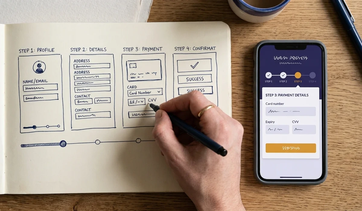
Four steps instead of one wall. The 31 fields were restructured into a four-step progressive flow:

  1. Step 1 — Program interest. Faculty → program → campus, using three cascading selects instead of a 34-item dropdown. Three taps, and the university already knows what the applicant wants.
  2. Step 2 — Academics. Last qualification, board or university picked from a validated list, and grades — with conditional fields that appear only where relevant (test dates for engineering technology, no test fields for law).
  3. Step 3 — Contact. Name, mobile number with an input mask, city, and email marked optional — analysis showed email demanded in full format was a quiet killer, and WhatsApp plus phone reaches nearly every Pakistani applicant.
  4. Step 4 — Review and submit. A summary of everything entered, a plain-language privacy note, and one button.
ElementOld formNew progressive form
Structure31 fields, single page4 steps of 5–7 fields
First askCNIC + documents context3 taps of program interest
DocumentsBlocking upload at field 9Post-submit verification link
ValidationSubmit-time error wallInline, per field, plain language
Phone/CNIC entryFree textInput masks (03XX-XXXXXXX, XXXXX-XXXXXXX-X)
Mobile layoutDesktop squeezeThumb-first layout, large targets
ProgressNone4-step progress bar
ResumeNoneSave-and-resume over email or WhatsApp

Documents moved past submit. The blocking upload was replaced with a post-submit checklist: after the application is recorded, the applicant receives a secure link to upload documents, with size guidance and JPEG accepted alongside PDF. The university lost nothing in data quality — 98% of completers verified documents within 72 hours once asked — and stopped losing a fifth of applicants at field nine.

Errors that teach instead of punish. Inline validation on blur, error text in plain language (including roman-Urdu phrasings for the most common failures), and masks that format CNIC and phone numbers as the applicant types. The captcha was replaced with an invisible challenge that does not reload on slow connections.

Save-and-resume. Applicants who abandon mid-flow receive a resume link over email or WhatsApp. In a market where applicants share devices and lose connectivity, resume recovered applicants who would otherwise have been counted as dead: 9% of starters used it, and 62% of those completed later.

One form, three purposes. The three overlapping forms were consolidated into one progressive flow with an early branch — enquiry, application, or scholarship — sharing steps one and three so that measurement and maintenance collapsed into one system. An enquiry that later converts to a full application no longer re-types anything; the branch carries the captured steps forward.

Trust and transparency at the decision moment. Two additions cost nothing and measurably helped: a plain-language privacy line on the review step stating exactly how the data is used and who calls the applicant, and eligibility transparency on step one — where a program has a merit threshold or an entry test, the step says so before the applicant invests in the flow. Recordings repeatedly showed applicants abandoning after discovering a requirement at the final step; surfacing it early filtered the wrong traffic kindly and reassured the right traffic.

Accessibility as conversion hygiene. Field labels stayed visible above inputs rather than as placeholder text that vanishes on focus, error states were conveyed with wording and iconography rather than color alone, and every step passed keyboard navigation. These are correctness details for screen-reader users and speed details for everyone else — on shared family devices, they reduce mistakes that show up in the error logs as frustration.

Phase 3 — Test, Iterate, and Harden (Weeks 5–8)

The redesigned form launched to 50% of traffic, with the old form held as control for three weeks. Tests ran one variable at a time against that split, each held until it cleared two full weeks of traffic so that weekday and weekend behavior both figured into the read — a deliberately slow cadence that trades speed for decisions nobody relitigates later.

TestVariant comparisonResultDecision
Step-1 length3 fields vs 5 fields3-field step won: +12% progression to step 2Shipped
Document ask placementBlocking upload vs post-submitPost-submit won: +26% submit rateShipped
Error copy styleCode-style (“Invalid format”) vs plain roman-Urdu guidancePlain guidance cut repeated errors per session 41%Shipped
Trust line near submitNone vs named alumni count+4% submit rateKept as low-cost win

Two additional hardscrabble fixes came out of live monitoring: an Android keyboard quirk that hid the step button behind the autocomplete bar on small screens, and a marks-entry field that rejected percentages above 100 typed by mistake — both found in the error logs within days of launch and patched inside a week, which is precisely what field analytics exists to enable.

By week eight, the new flow’s completion rate had stabilized eleven points above control, and rollout to all traffic followed.

Phase 4 — Roll Out, Hand Off, and Measure (Weeks 8–12)

See this in action

How we helped a Pakistani business achieve measurable results.

Read case study

Phase 4 made the gains durable.

Full rollout and staff enablement. The final flow shipped to all admission pages, and the admissions team was trained on the new dashboard — where every applicant sits in the funnel, which step stalls by program, and which error messages fire most. The playbook documented the templates, the event schema, and the testing cadence so the team could keep iterating without external dependency.

A thank-you page that works. The confirmation page was redesigned to offer the next action — booking a campus visit. Eighteen percent of completions booked a visit directly from it, turning the form’s best moment into the funnel’s next step instead of a dead end.

The support-call dividend. With blocking errors and status confusion gone, form-related calls fell from 180 to 115 a day in the peak week, and the admissions office redirected that capacity to follow-up calls on incomplete applications — a recovery loop that had never been possible when “incomplete” was invisible.

Final Results

Measured at day 90 against the pre-launch baseline:

MetricBaselineDay 90Change
Form completion rate (all devices)27%39%+44%
Mobile completion rate20%31%+55%
Desktop completion rate38%54%+42%
Completed applications, peak month1,0901,600+46%
Form starts, peak month4,0504,100+1%
Paid cost per completed applicationPKR 4,100PKR 2,950−28%
Document-stage abandonment22% of starters6%−16 points
Form-status calls, peak week180/day115/day−36%

The detail worth pausing on: form starts barely moved (+1%). The gain came almost entirely from the same applicants finishing — the university had been buying this traffic all along and simply stopping it at field nine. That is what makes form optimization the cheapest growth lever in most Pakistani funnels: no additional media spend is required to convert the traffic you already pay for.

What Made This Work

  1. Instrumentation preceded design. Two weeks of field analytics settled questions that the institution had debated for two years. The redesign brief was written from drop-off data, not taste — which is why it survived every review meeting.
  2. The deadliest field was removed, not improved. Conventional wisdom would have optimized the document upload. Moving it past submit eliminated the abandonment class entirely while data quality held at 98% verification.
  3. Mobile-first was treated as the primary layout. With 68% of applicants on phones, thumb-sized targets, input masks, and inline errors were not enhancements — they were the product.
  4. Commitment was sequenced. Three easy taps before anything demanding, contact details captured before deep history, and a summary review before submit. Each step earned the next.
  5. The call center became a measurement instrument. Call-log categories turned support volume into an outcome metric, and the 36% reduction validated the redesign in the operational numbers the rector actually reads.

What Teams Can Apply

For any Pakistani institution or business running lead-capture forms:

  1. Instrument fields before redesigning. form_start, step completions, field errors, and submit events cost a day of work and convert every future design debate into a lookup. If you cannot see where applicants stop, you are redesigning blind.
  2. Move uploads and documents past submit. Blocking friction at the highest-intent moment is the most expensive mistake in Pakistani forms. Ask after you have captured the applicant, not before.
  3. Design for the thumb and the patchy connection. Input masks, large targets, plain-language errors, save-and-resume — these details carry more conversion weight on 3G-era connections than any headline copy.
  4. Treat completion rate as a cost lever. A 44% completion lift on flat spend cut cost per completed application 28%. The same mechanics apply to clinic appointment forms, property enquiry funnels, and demo requests — the step structure changes, the sequence of measure, restructure, test, and roll out does not.
  5. Consolidate overlapping forms into one measured system. Three forms with duplicated fields meant three unmeasured funnels and triple the maintenance. One branched flow with shared steps gave the admissions office a single dashboard to read and a single source of truth for what applicants actually do — and made the next improvement testable instead of debatable.

Institutions that want the fuller methodology can extend this into a structured conversion rate optimization programme, and education teams will find the sector-specific demand patterns in our guide to digital marketing for educational institutions. WeProms Digital has applied this framework across Pakistani universities, training institutes, and school systems — the form shapes differ, the field-level discipline never does.

What teams can apply

Use the framework, not just the headline number.

For GEO, AEO, and classic SEO, the useful signal is the sequence: fix crawl access, build answerable category assets, improve conversion paths, and document proof in a format that humans and machines can cite.

Field-level analytics located the real drop-offs — documents and the final error wall — instead of guessing that the form was simply too long

Moving document upload past submit removed the highest-friction moment before applicant intent cooled

A mobile-first step layout with input masks and plain-language inline errors matched how applicants actually opened the form

Limitations

Context and limitations

Illustrative composite built from common patterns across Pakistani education engagements; completion lift varies with traffic quality, program competitiveness, and intake seasonality.

Questions

Case study FAQs

Is this admission form optimization framework applicable in Pakistan?

Yes. The framework is designed around Pakistani applicant behavior: mobile-dominant traffic, shared devices, patchy data connections, CNIC and board/university document conventions, and error guidance that works in plain language. The progressive structure and field-level measurement adapt to universities, training institutes, and schools alike.

How quickly can we expect results?

Instrumentation lands in the first two weeks, the redesigned form typically goes live in weeks four to six, and measurable completion lift appears within two to three weeks of launch. Full effect shows at the next intake peak, when volume stress-tests the flow.

Can you replicate this process for our institution?

Yes. We map the same phases to your programs, intake calendar, and admissions team workflow. The framework applies to semester-based universities, professional training institutes, and school admissions, and the same lead-capture mechanics transfer to clinics and real-estate enquiry funnels.

Do you provide reporting during implementation?

Yes. Weekly checkpoints cover instrumentation health, test results, and completion metrics. Step and field-level dashboards are shared from day one so your team sees the same numbers we do.

Next step

Want a similar rollout in Pakistan?

Share your current baseline and we will map a phased execution plan to your growth goals.

Book Free Strategy Call

Start Here

Let's talk about your growth system

Book a strategy call to discuss how WeProms Digital can help your business achieve better tracking, cleaner attribution, and more accountable growth.

Your data is secure
Typically respond within 2 hours
No obligation - just a conversation
Contact workflow From first message to a useful next step
Step one Context received

Your goals, market, and current channels are captured before we suggest a direction.

This helps us recommend the right engagement level for your needs.

We'll respond via email within 1 business day. Your details are kept confidential.