Most Pakistani businesses believe that connecting Google Analytics to a Looker Studio dashboard means they have marketing measurement under control.
This belief is the most expensive assumption in Pakistani digital marketing. What these businesses actually have is a real-time display of numbers they haven’t verified, collected by tags they haven’t tested, tracking events they haven’t defined. The dashboard looks professional. The charts animate smoothly. The colours stay consistent across tabs. But Digital Applied’s compilation of marketing analytics statistics reports that 87% of marketing leaders say data-driven decisions are critical to their success while only 32% actually trust the quality of their data. That 55-point gap between aspiration and confidence exists because businesses build the visualization layer before auditing the collection layer. A dashboard reporting 100 monthly conversions when 60 actually occurred doesn’t inform decisions. It misleads them. And in Pakistan’s ecommerce market — where Cash on Delivery rejection, cross-domain payment flows, and mobile browser tracking loss distort every metric — the gap between reported and actual is substantially wider than global benchmarks suggest.
What your marketing dashboard is actually showing you
Dataslayer’s analysis of marketing dashboard usage reports that 72% of dashboard users export their data to Excel for further analysis. The market’s own users are telling us something important: the dashboard isn’t sufficient for decision-making, so they revert to spreadsheets to do what the dashboard should have done in the first place. This pattern repeats across industries and geographies, but the cause is always the same — the data feeding the dashboard hasn’t been validated against reality.
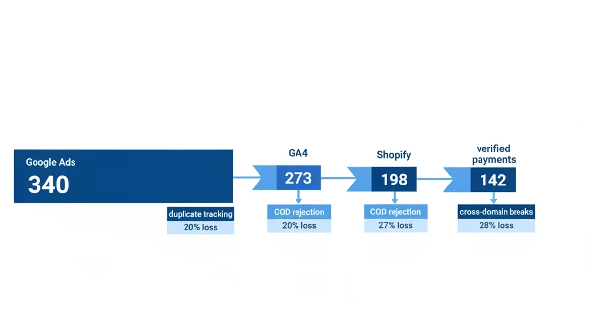
Picture a Pakistani ecommerce store’s typical Looker Studio setup. The dashboard pulls data from GA4, Google Ads, and perhaps Meta Ads. It displays sessions, clicks, conversions, cost per acquisition, and return on ad spend in neat tiles. Every metric appears precise to the decimal point. None of them have been reconciled against actual bank deposits or verified CRM records. The Google Ads column shows 340 conversions this month. GA4 reports 273. Shopify’s admin panel logs 198 completed orders. The bank statement confirms 142 verified payments received. Four numbers describing one reality, with a 240% inflation from the top of the funnel to the bottom.
The operator never sees the bank number.
LayerFive’s analysis of marketing budget waste estimates that 47% of marketing budgets are wasted due to poor attribution and unclean data. For a Pakistani business spending PKR 300,000 monthly on paid advertising, that translates to roughly PKR 141,000 burning every month into misallocated spend. The ads might be well-designed. The targeting might be precise. But the data telling the business which ads perform is wrong, so budget flows toward phantom performance instead of actual revenue.
Why Looker Studio makes the problem harder to see
Looker Studio is free. That single fact has accelerated dashboard adoption across Pakistani businesses faster than data quality practices can keep pace with. When a Lahore marketing manager can connect a GA4 data source and generate a conversion chart in ten minutes, the perceived cost of building a dashboard drops to zero. The actual cost — decisions made on unverified data — stays constant. What changes is the operator’s confidence in those decisions, which increases precisely because the chart looks polished and professional. The interface rewards speed over accuracy. Default connectors pull raw data from GA4 and Google Ads without any validation layer between the source and the visualization.
If GA4 is counting duplicate events from a WordPress plugin and a Google Tag Manager container firing simultaneously, the dashboard displays those duplicates as real conversions. If Google Ads is attributing conversions to campaigns that merely assisted rather than drove the final click, the dashboard reports the assisted conversions as direct performance. No warning appears. No data quality indicator flags the discrepancy. The chart simply renders whatever numbers the API returns, and the operator interprets those numbers as truth.
This creates a dangerous feedback loop. The operator opens the dashboard, sees strong numbers, and decides to maintain or increase current spend. The strong numbers were inflated by tracking errors the dashboard cannot detect. The increased spend amplifies the waste. The dashboard next month shows even stronger numbers because the same tracking errors now process a higher volume of traffic. Every participant in the cycle — the business owner, the marketing team, the agency running the account — feels confident because the charts trend upward. The bank account tells a different story that nobody checks until the quarterly P&L meeting reveals the mismatch.
The chart moves up. The bank account moves sideways.
Why Pakistani businesses are uniquely exposed to bad dashboard data
Book a free strategy call - we'll audit your current setup and identify the highest-impact fixes.
The gap between dashboard reporting and business reality widens in Pakistan for three structural reasons that most global marketing advice never addresses.
Cash on Delivery accounts for 60 to 80 percent of Pakistani ecommerce transactions, depending on category. Every COD order fires a “purchase” event at checkout completion, but 30 to 40 percent of those orders get rejected or returned at delivery in categories like fashion and electronics. The dashboard records the checkout as revenue. The bank never receives payment. The ad algorithm optimizes toward traffic that places orders but doesn’t complete payment. The dashboard shows growing conversion volume month over month. Revenue stays flat or declines. Nobody connects the two trends because they live on different dashboards — the ad platform reports conversions going up, the finance team reports cash flow going nowhere, and the gap between them never appears in a single view.
Payment routing through JazzCash, Easypaisa, and bank redirect pages breaks cross-domain tracking silently. When a customer clicks an ad, lands on the merchant’s site, adds products to cart, and completes payment on jazzcash.com, GA4 treats the domain transition as a new session unless cross-domain linker configuration is explicitly set up. Most Pakistani stores haven’t configured this. The ad platform registers the click but sees no conversion. The algorithm interprets the traffic as low-quality and reduces delivery. The operator sees declining performance in the dashboard and increases bids to compensate. Cost per acquisition rises while the actual cause — a broken tracking link between two domains — never appears on any dashboard, because dashboards cannot diagnose their own data sources.
Pakistan’s mobile-first audience compounds both problems. Mobile traffic exceeds 70 percent for most Pakistani ecommerce stores, and mobile browsers implement tracking prevention that client-side analytics cannot bypass. Safari’s Intelligent Tracking Prevention blocks cookies on iOS devices by default. Firefox’s Enhanced Tracking Prevention does the same on Android. Together, these restrictions render a significant share of mobile conversion data invisible to standard tracking setups. According to DataReportal’s Digital 2026 Pakistan report, Pakistan’s internet user base reached 117 million in early 2026 with mobile dominating access. The audience scale is enormous. The measurement infrastructure connecting that audience to actual business outcomes remains critically underbuilt. A dashboard that visualizes incomplete mobile data doesn’t reveal the gap — it conceals it behind charts that look comprehensive.
The measurement system that replaces the dashboard habit
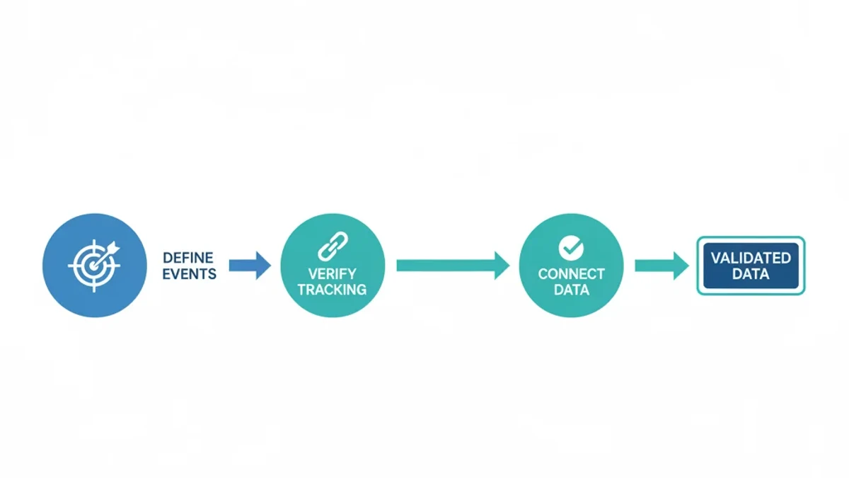
The distinction between a dashboard and a measurement system matters because the fix for misleading dashboards is not better dashboards. A measurement system defines which metrics connect to business outcomes, specifies how those metrics get collected and validated, and only then determines how they get visualized. BCG’s framework for marketing measurement argues that organizations integrating multiple measurement approaches — combining attribution modeling, marketing mix modeling, and incrementality testing — consistently outperform those relying on any single method. The same principle applies at the data layer: businesses that verify accuracy across multiple sources before building reports make better decisions than those that connect a data source to a chart and call it analytics.
Only 44% of organizations have formalized measurement frameworks, according to Digital Applied’s research. The rest have dashboards. The difference is not visual — it is structural. A measurement framework specifies what “conversion” means for a specific business, confirms that the tracking infrastructure captures that definition accurately, and builds reporting around validated data. A dashboard specifies which colour palette to use for the bar chart. Both serve a purpose, but only one produces reliable decisions.
For Pakistani businesses, building a measurement system starts with three verifications that precede any visualization work. First, confirm that GA4 custom events track business-specific actions rather than default page views. Crazy Egg’s guide to GA4 key events emphasizes that defining custom conversion events — “COD order confirmed upon delivery” rather than “page view on thank-you page” — is what separates functional analytics from decorative reporting. Second, verify that cross-domain tracking links the main site to payment gateway domains so the customer journey remains continuous across JazzCash, Easypaisa, and bank redirects. Third, connect the CRM to ad platforms through Enhanced Conversions and Conversions API so verified purchase data flows back to the algorithms driving bid optimization.
Three verifications. Zero new dashboards.
The data that emerges from this process is the only data worth visualizing. Everything else is decoration.
Where to start when you stop building charts
The practical starting point is not Looker Studio. It is a spreadsheet with three columns: the metric your dashboard currently reports, the actual business outcome that metric claims to represent, and the gap between them. When a Pakistani fashion store lists “Google Ads conversions: 340” in column one and “verified payments: 142” in column two, the gap in column three — 198 phantom conversions — tells the operator more than any dashboard chart ever will. The exercise takes thirty minutes and requires no tools beyond a spreadsheet and access to the ad platform, the CRM, and the bank statement.
Here’s the thing. Most teams miss this because dashboards never look broken.
A chart showing 340 conversions with a 12% month-over-month increase looks like growth. The same data showing 142 verified payments with a 3% decline tells a completely different story. Both come from the same data source. The difference is which number gets visualized and which one gets verified against the bank account. Pakistani businesses that verify before they visualize discover that their tracking problems are not minor inaccuracies — they are structural misalignments between what the tools report and what actually happened.
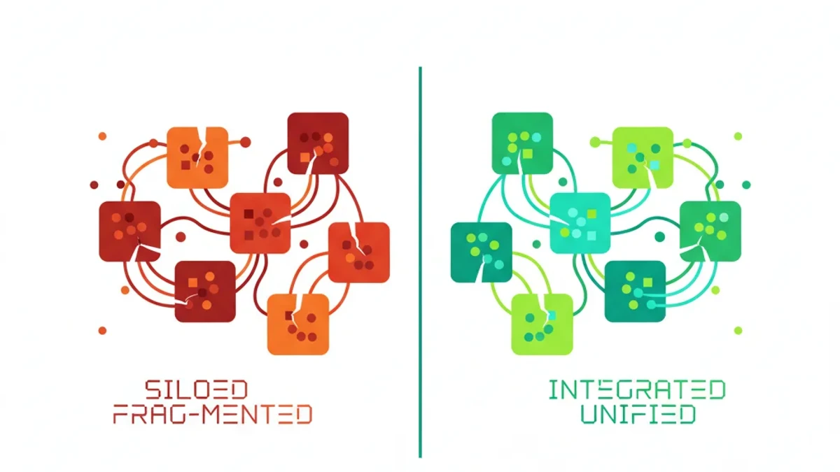
HubSpot’s marketing statistics report that 68% of marketing teams cite data silos as their primary barrier to performance analysis. Building another dashboard that pulls from the same siloed sources does not dissolve the silos. Connecting those sources through server-side tracking, CRM integrations, and platform APIs dissolves them. The lever is integration, not visualization. Once the data flows accurately between tools, the dashboard — if it is still needed — reflects reality instead of aspiration.
The weekly measurement rhythm replaces the daily dashboard check. Instead of opening Looker Studio every morning to see what changed overnight, the operator opens the CRM once per week, compares new verified revenue against the ad platform’s reported conversions, and flags any gap exceeding 15%. When the gap crosses that threshold, the investigation targets the tracking layer — duplicate tags, broken cross-domain links, COD phantom events — rather than the chart design. This takes ten minutes. A dashboard build takes weeks. The former produces accurate decisions. The latter produces attractive slide decks.
The principle is straightforward: verify collection before visualizing output. A measurement system built on validated data makes every downstream report more accurate, every algorithmic bidding decision more efficient, and every budget allocation more defensible. A dashboard built on unverified data does the opposite — it provides the comfort of visibility without the discipline of accuracy. Pakistani businesses that recognize this distinction, and act on it before their competitors do, will compound their advantage with every month of cleaner data feeding sharper optimization.
Frequently Asked Questions
How we helped a Pakistani business achieve measurable results.
How can a Pakistani business check if its marketing dashboard data is accurate?
Open your ad platform dashboard and your CRM side by side. Compare conversions reported by Google Ads or Meta with verified revenue in your CRM or bank statement for the same date range. If the gap exceeds 15%, your tracking has structural issues — likely duplicate tags, missing cross-domain configuration, or COD phantom conversions counted as completed purchases. The dashboard itself will never flag this discrepancy. You have to check manually.
Should a Pakistani business build a Looker Studio dashboard or fix GA4 tracking first?
Fix GA4 tracking first, without exception. A dashboard built on inaccurate data gives false confidence that leads to worse budget decisions. Before opening Looker Studio, verify your GA4 custom events track actual business outcomes like delivery-confirmed purchases rather than checkout page views, cross-domain tracking connects to JazzCash and Easypaisa redirect domains, and Enhanced Conversions sends verified purchase data back to Google Ads. Build the dashboard last, not first.
What does a marketing measurement system cost for a Pakistani SME?
A tracking audit and correction typically costs between PKR 80,000 and PKR 200,000 depending on conversion event complexity and the number of platform integrations required. Compare this against monthly waste — a business spending PKR 300,000 monthly with 47% data-driven waste loses approximately PKR 141,000 every month. The measurement system pays for itself within the first billing cycle through recovered ad spend. Looker Studio itself is free, but the data quality work that should precede it is not.
Why does Cash on Delivery create dashboard reporting problems for Pakistani stores?
COD creates a timing gap between order placement and confirmed revenue. Standard purchase events fire at checkout completion, but 30 to 40% of COD orders in Pakistani fashion and electronics categories get rejected or returned at delivery. A dashboard that counts checkout completions as purchases overstates revenue and conversions by this margin. The ad algorithm then optimizes toward traffic that places orders without completing payment. The fix requires delayed conversion tracking that fires only after delivery confirmation, connected through the order management or CRM backend.
Sources & References
- Digital Applied — Marketing Analytics Statistics 2026 Data Points — 2026
- Dataslayer — Marketing Dashboard Best Practices 2025 — 2025
- LayerFive — Stop Marketing Budget Waste — 2026
- BCG — Six Steps to More Effective Marketing Measurement — 2025
- DataReportal — Digital 2026: Pakistan — 2026
- Crazy Egg — Track Key Events from GA4 as Conversions — April 2026
- HubSpot — Marketing Statistics — 2026